RealSavvy
For my final project at General Assembly, I worked with a partner to consult RealSavvy, a real estate start-up based in Austin.
Project Duration: 3 weeks
Tools: Sketch, Invision, pencil & paper
THE CHALLENGE
RealSavvy knew the MVP site needed revisions but was unsure where to start. The founders asked us to audit their site, and provide design suggestions in areas we felt needed the most improvement. Their goal was to increase the number of users - agents and home seekers - by improving user engagement and delight.
THE APPROACH
Stakeholder interviews uncovered a wide breadth of proposed topics and ideas. We wanted to help RealSavvy narrow their scope and prioritize their efforts.
The client had only focused on agent users, so we wanted to target home seekers early.
PROCESS
STAKEHOLDER INTERVIEWS
We met with each co-founder separately to learn what they hoped to get from this project, and found differences in the scope of their ideas. One hoped to explore fun, new features, while the other wanted to slow down and improve the existing site. Luckily both agreed that we should target what we felt to be most important, and most feasible for a 3 week project.
DOMAIN RESEARCH
Learning about the real estate industry was a crucial first step. We wanted to understand how our two user types interacted through the home buying process.
Initial research uncovered the problem of data integrity on real estate sites, and we explored the constraints that led to bad data.
USER RESEARCH
RealSavvy’s users fell into two primary categories: agents and home seekers.
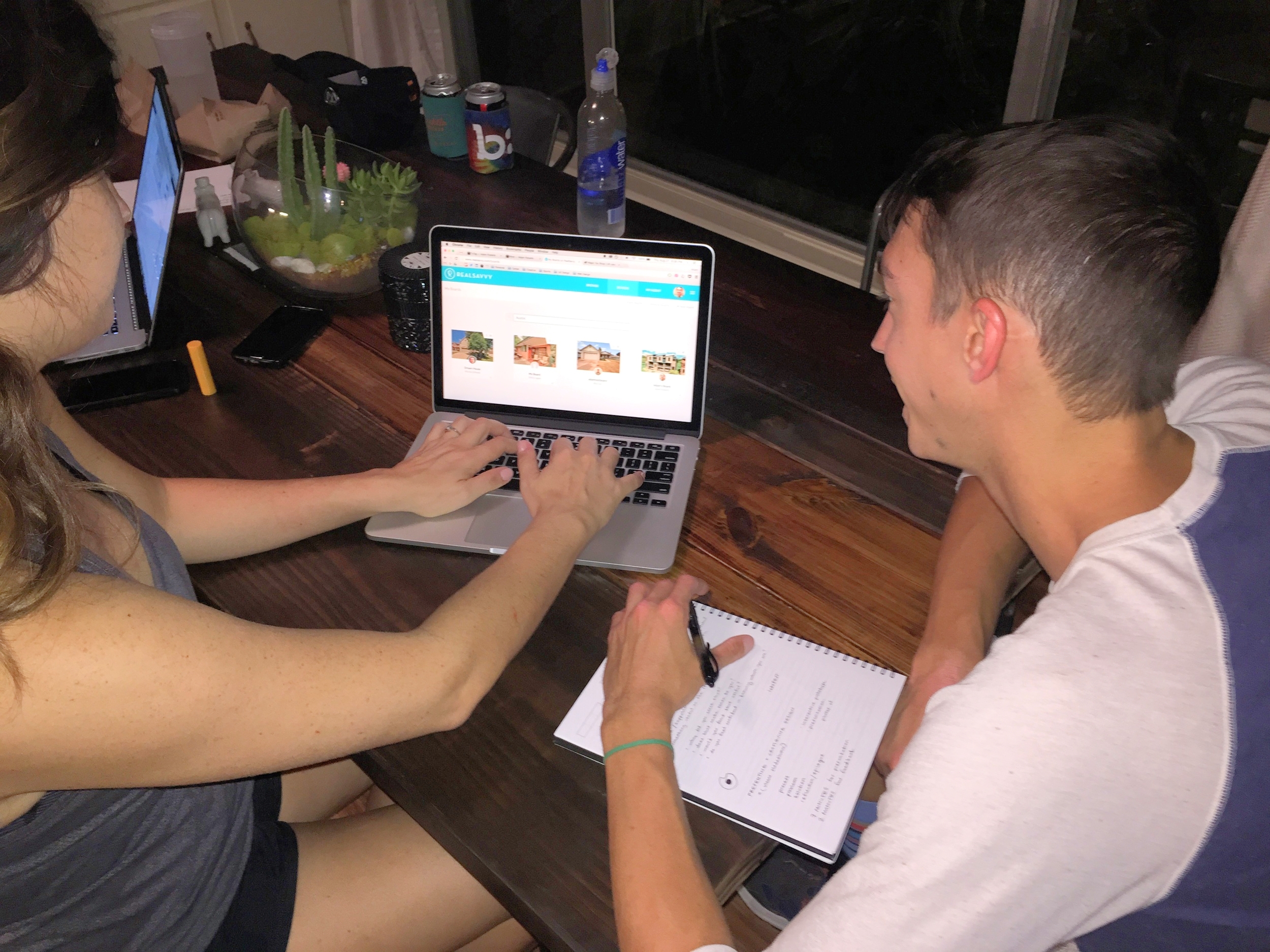
From published market research and five interviews, we learned how today’s home seekers search online, what they look for in an agent, and primary pain points in home buying process. I also ran usability tests after each interview, and found that RealSavvy’s primary offerings were poorly communicated to first-time users.
We contacted brokers and met four real estate agents for interviews and usability testing. From these we learned of pain points when working with multiple clients, inaccurate data, and how agents try to differentiate themselves. We discussed agents’ primary incentives, and how viable the current offerings of RealSavvy were.
We used our findings to create two user personas:
HEURISTIC REVIEW
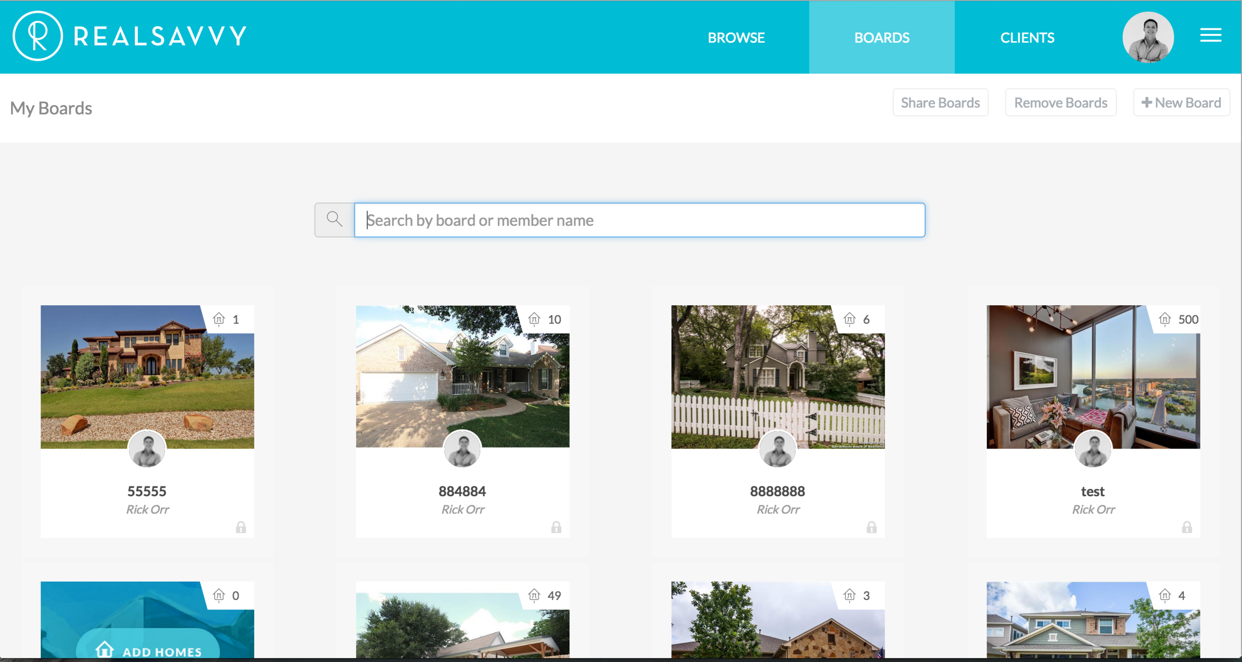
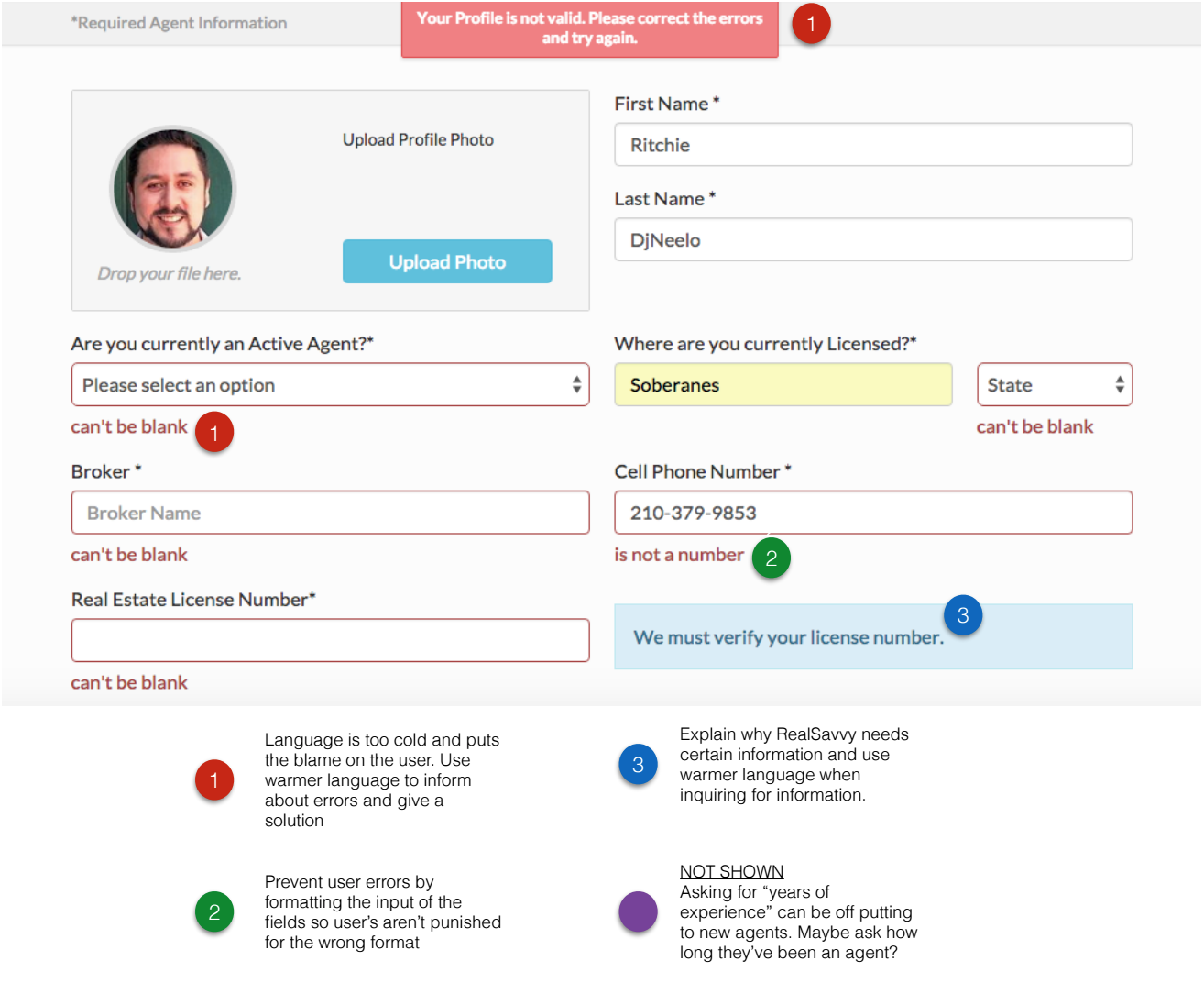
The client asked us to review their site for performance and usability concerns. We noted specific issues in a spreadsheet, and also graded the site against Nielsen’s Usability Heuristics. These recommendations were presented to the client as take-home deliverables, with annotated screenshots as needed.
JOURNEY MAPPING
We synthesized findings from our user research and heuristic review to chart the experience of our two personas and their use of RealSavvy through the home buying process. This map helped us identify gaps to target for redesign.
DESIGN
With 10 days remaining, we chose two specific features to design:
SHARED CALENDAR
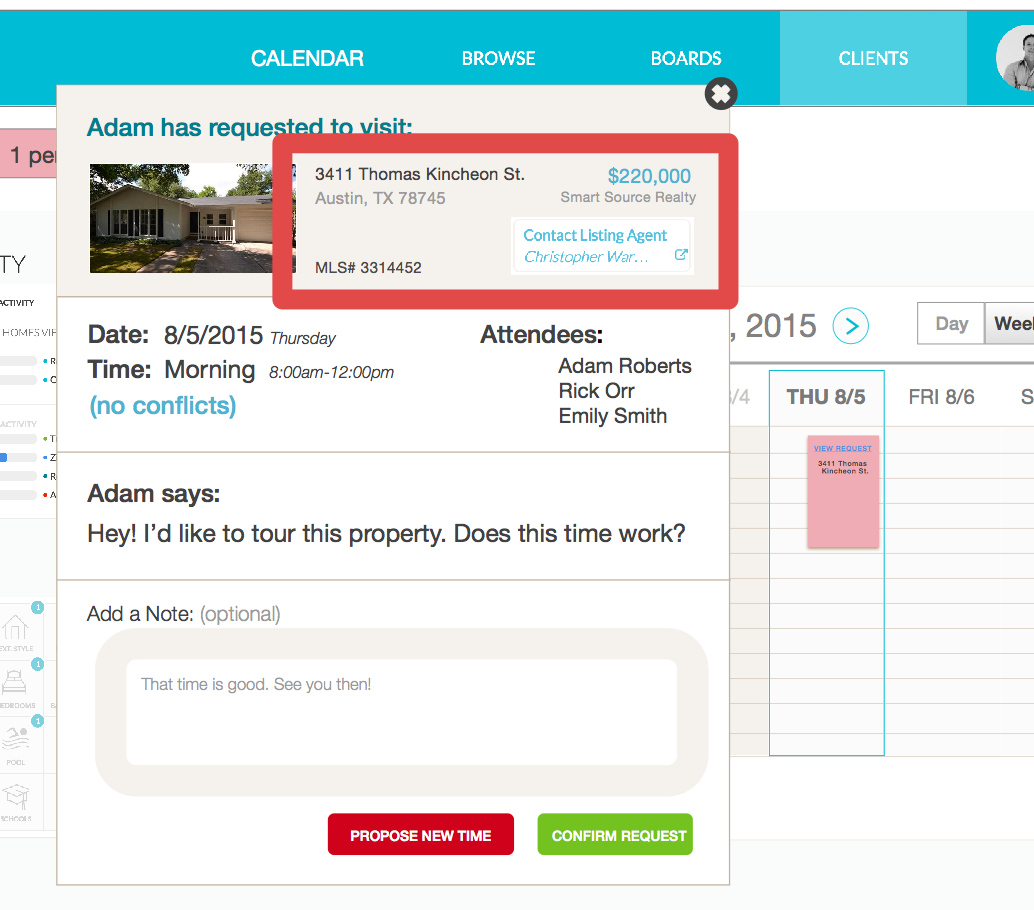
In interviews we learned about agent pain points when juggling multiple clients. Managing and scheduling home tours can be complicated, and agents have concerns they’ll miss an appointment. RealSavvy marketed itself as a collaborative tool for home buyers and agents, and we felt a shared calendar feature would fit with this goal as well as address user pain points.


HOW IT WORKS
During usability tests we found that RealSavvy’s best features were overlooked by first-time users. The site had a “How It Works” page to educate new users, but it was lost on the homepage and went unnoticed.
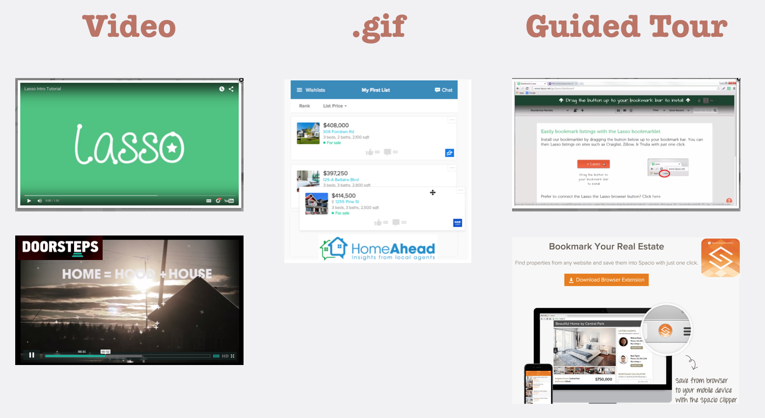
I did a competitive analysis to determine how other sites explained their features to new users. Common methods were embedded video tutorials, animations, and guided overlays.
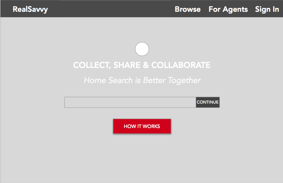
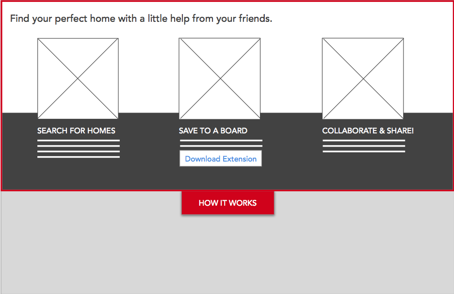
I set out to wireframe a solution that would be prominent, but also simple enough to implement quickly by the RealSavvy developers. By relocating the “How It Works” button to the top of the homepage and giving it a distinct color, users would be encouraged to click and learn. Instead of taking users to a new page, I designed a smooth scrolling window to drop down with the content.

