TxTag
For our third project at General Assembly, we worked in teams of three to design from a client brief. My team’s client was TxTag, the Austin-area toll provider, and our task was to help increase customer satisfaction and registration by improving user experience and offered services.
Duration: 2 weeks
Tools: Omnigraffle, Invision, pencil & paper
WHAT I DID
As a team we shared responsibilities, though some stages of the process were handled individually.
I assisted with user research, personas, competitive analyses, site navigation & wireframes, and independently completed task flows & user stories.
THE CHALLENGE
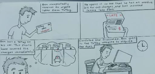
In several ways, the client’s issues stemmed from bad press. Third party billing distributors had mishandled the TxTag information, and thousands of paper bills were distributed in error. The fragmented TxTag system was not prepared to handle the heavy amount of customers demanding answers and resolutions.
THE APPROACH
Our brief highlighted some of the client’s considered methods of improving their customer experience: an improved registration flow, enhanced billing feedback, more detailed roadway information, etc. Keeping these in mind, we chose to examine the overall organization of the TxTag system in order to gain understanding of the domain and customer issues.
Process
USER RESEARCH
We prepared a user survey in hopes of reaching real TxTag users, and gained some insight into users’ understanding (or lack of) about the TxTag program. When asked “What type of TxTag membership do you have?”, over half of the participants didn’t know. This showed a lack of transparency about the various programs & benefits - something we could improve with our registration flow and overall site redesign.
We conducted a user interview and learned of negative experiences with TxTag's customer service, and he was not alone: these issues were well-documented by local press as well as social media. Austin-area news providers have dedicated webpages to investigate the toll issues, which supplemented our direct research well.
I used the research findings to create User Stories:
From here we created our User Personas:
DOMAIN RESEARCH
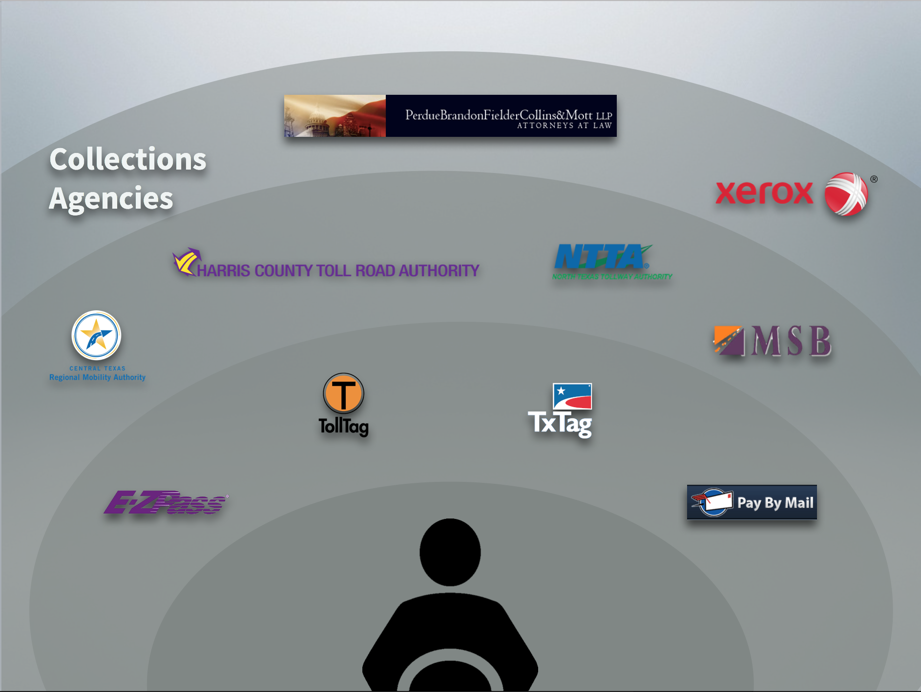
A deeper dive into the institutions behind the TxTag toll system provided insights into the customer service issues. Though advertised as a “one stop shop” for all Texas toll providers, the TxTag program was unable to communicate effectively with other primary cities’ providers. Beyond this, separate billing companies were responsible for collections in certain circumstances, meaning that a Texas driver could expect to receive a bill from a wide array of agencies.
This fragmentation proved to be a logistical nightmare for customers hoping to resolve billing questions.
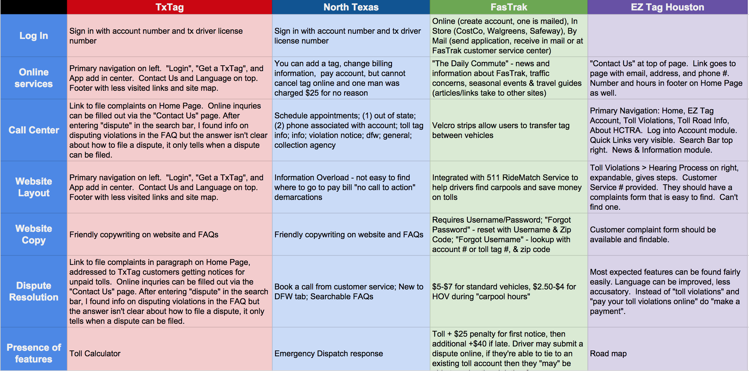
COMPETITIVE ANALYSIS
A common complaint from users was the lack of functionality on the TxTag website. Since phone lines were the primary means for receiving assistance, frustrated users often spent upwards of 30 minutes waiting to connect to a representative.
The client expressed an interest in a site makeover as well; they asked for improved registration flows and billing feedback - each achievable with website form redesigns.
We set out to analyze how other toll providers designed their websites, and noted the positive and negative traits we saw. Each teammate chose a different company to audit, and we consolidated our findings in a qualitative competitive analysis.
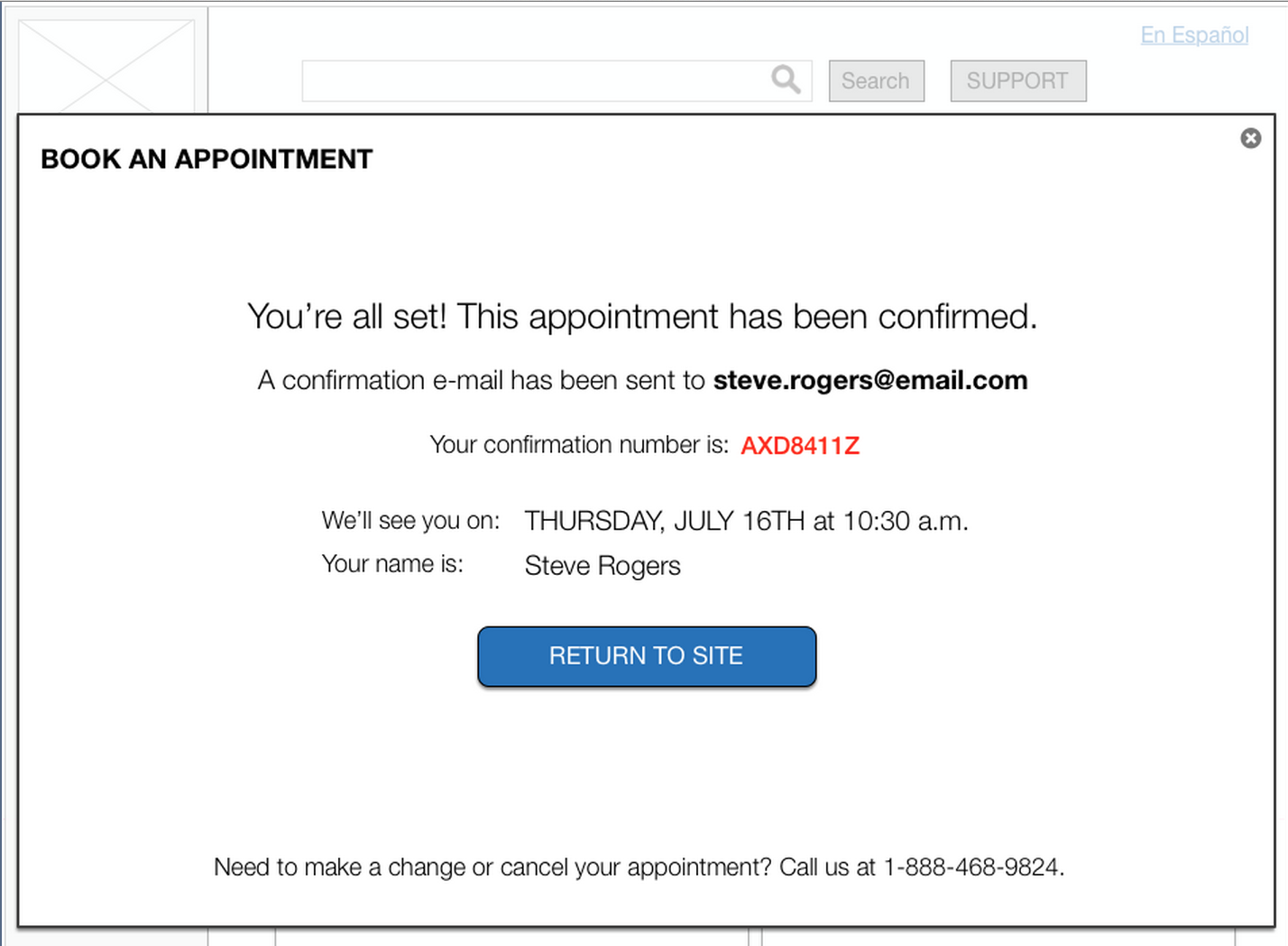
Our team saw an opportunity to better address customer service needs through an enhanced online dispute feature, as well as an appointment-based system for receiving support both over the phone and in person. After collecting examples of companies well-known for offering similar features, we set to work designing these forms. I was responsible for creating the forms to book an appointment, drawing inspiration from Apple’s well-known Reservation system.
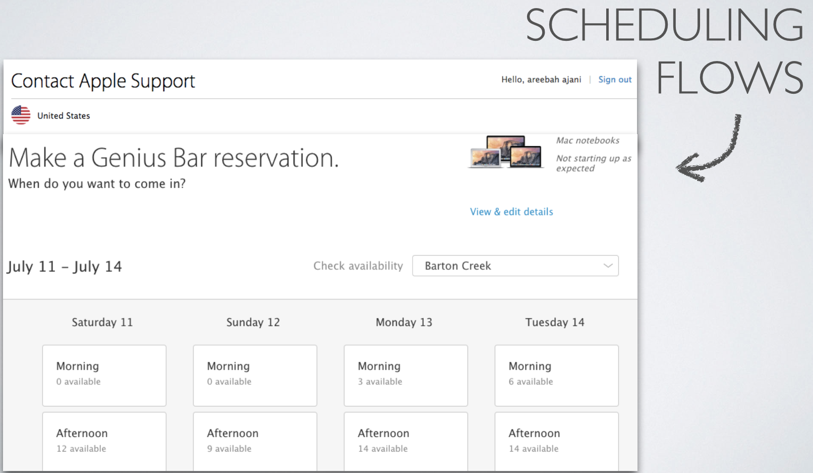
APPLE'S RESERVATION SYSTEM

MY APPOINTMENT DESIGN
Design
Compiling our various findings, we set out to redesign the site’s homepage. Using our personas and competitive analyses, we wrote down the various tasks that a user would go to TxTag’s website to perform.
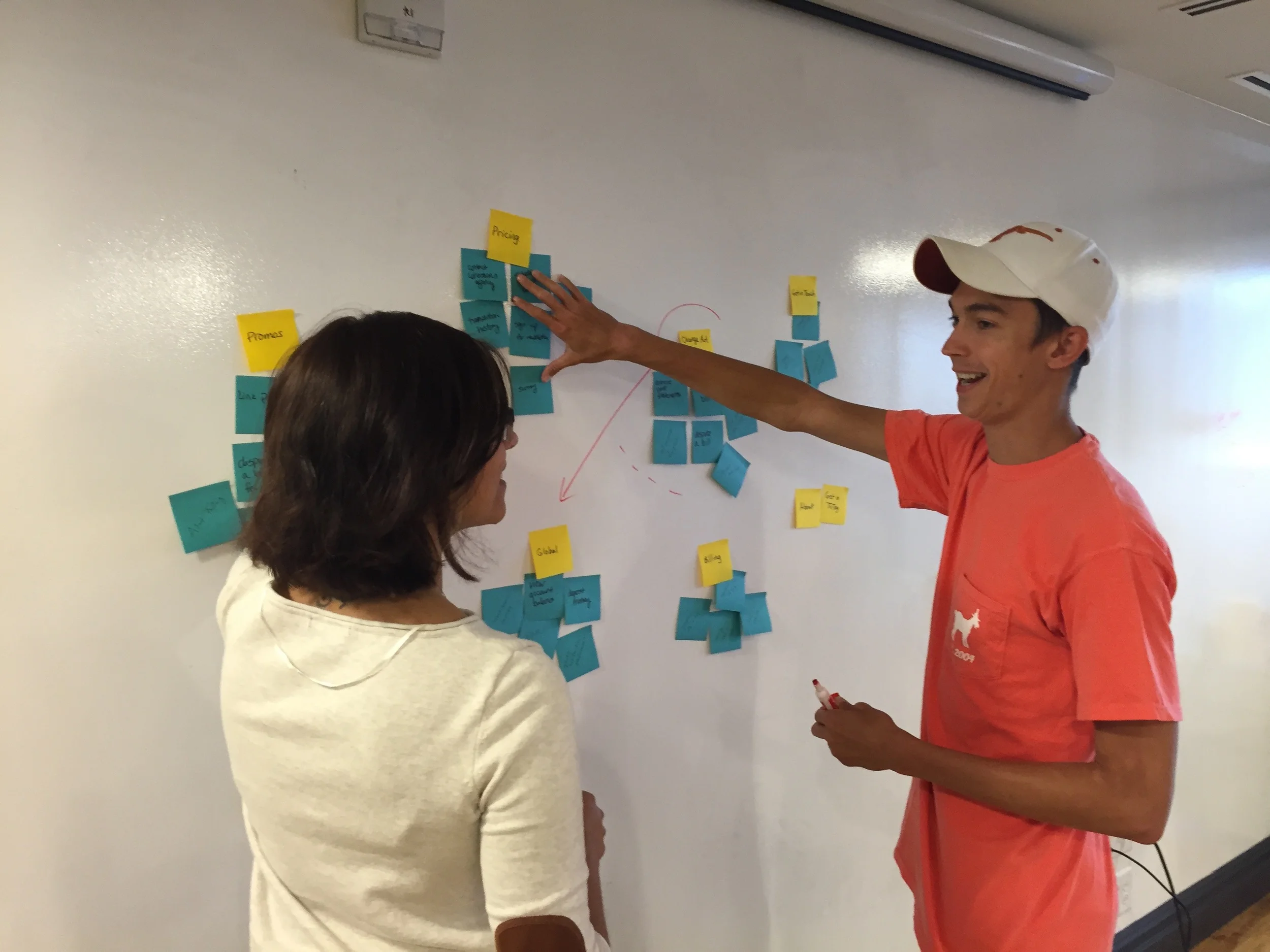
We used affinity mapping to group similar tasks, and made these groups our primary navigation categories. Keeping the client’s goals in mind, we laid out the homepage to provide quick access to User Registration/Sign In, Bill Pay, and Customer Support.
While Sean & Areebah tackled the redesign of Bill Pay and Dispute flows, I created the forms for scheduling Customer Service Appointments:
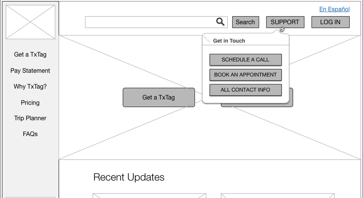
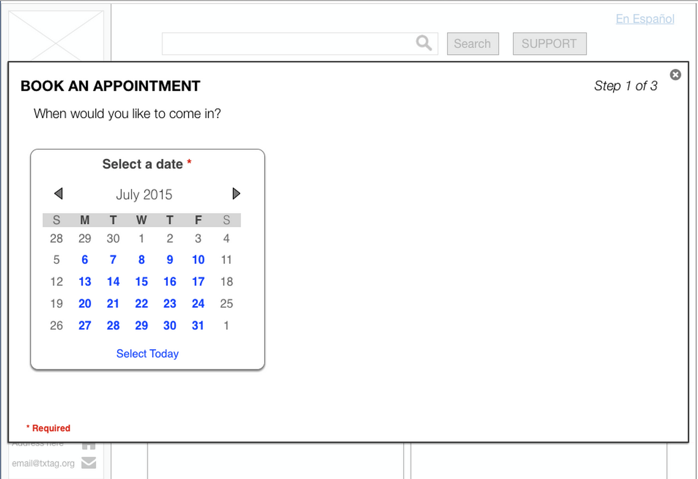
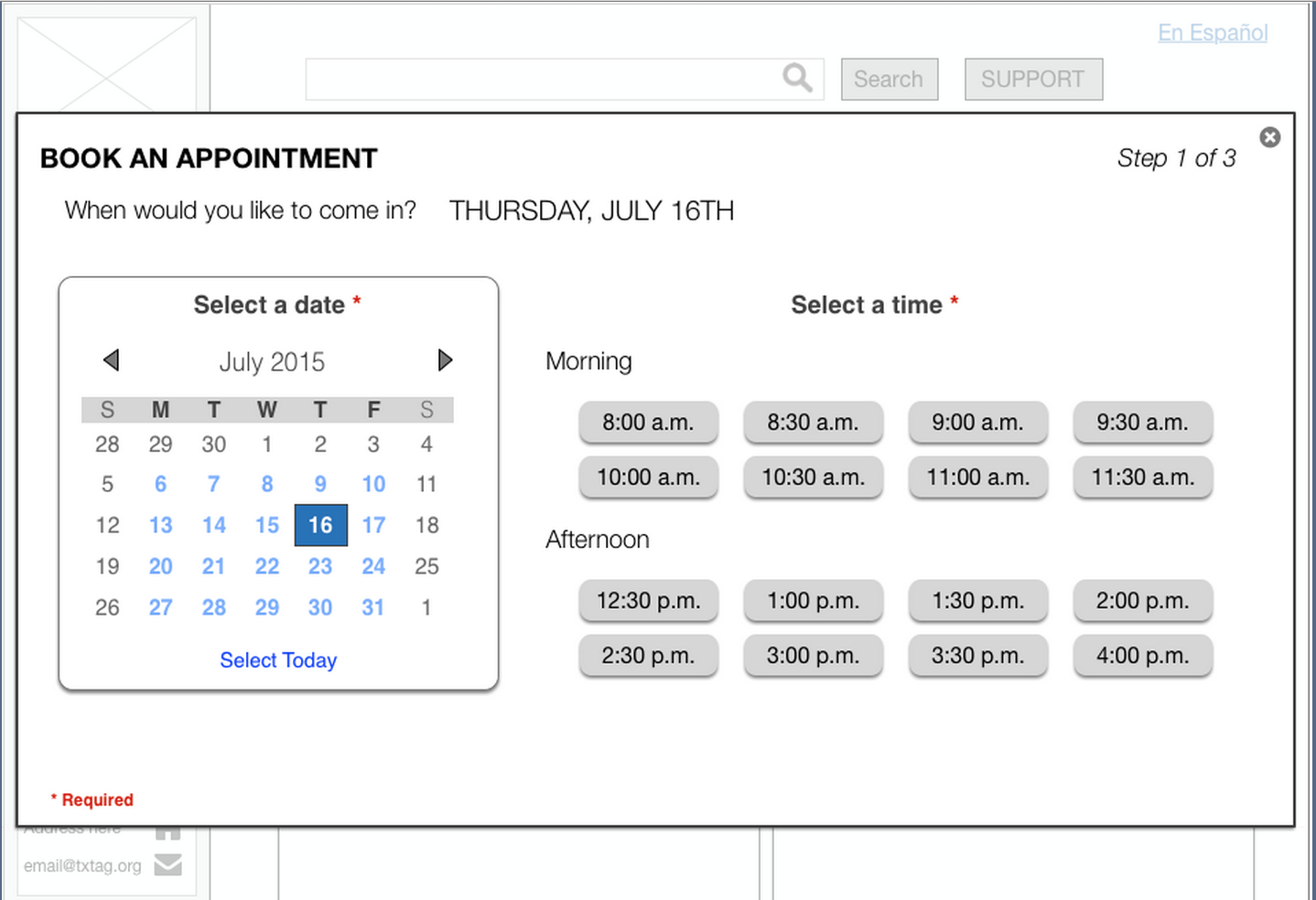
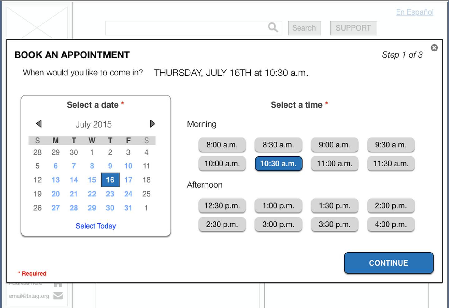
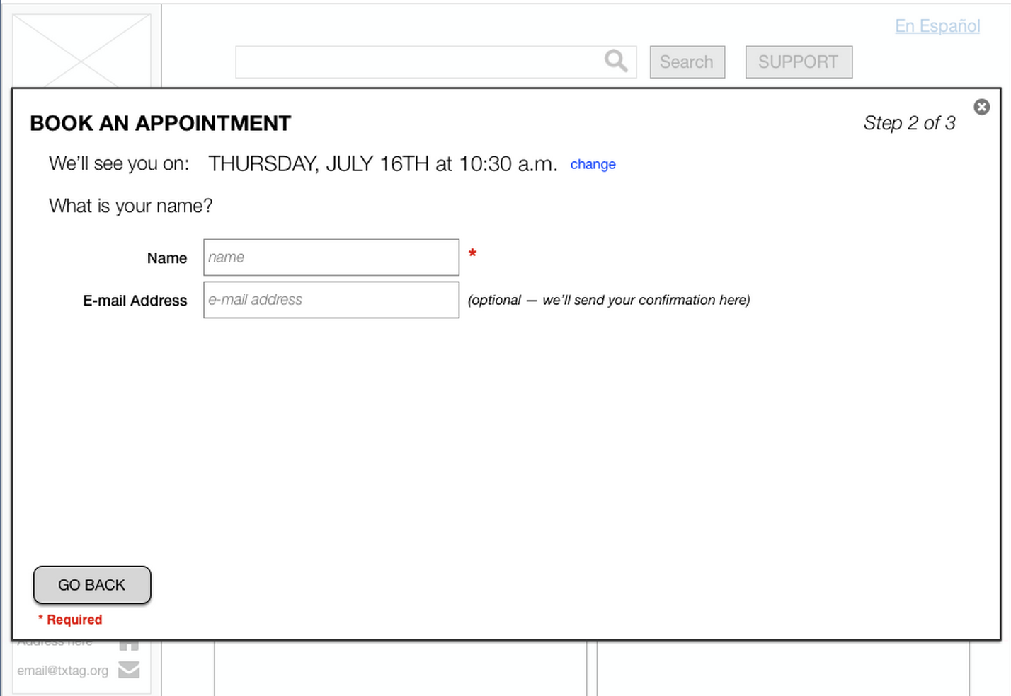
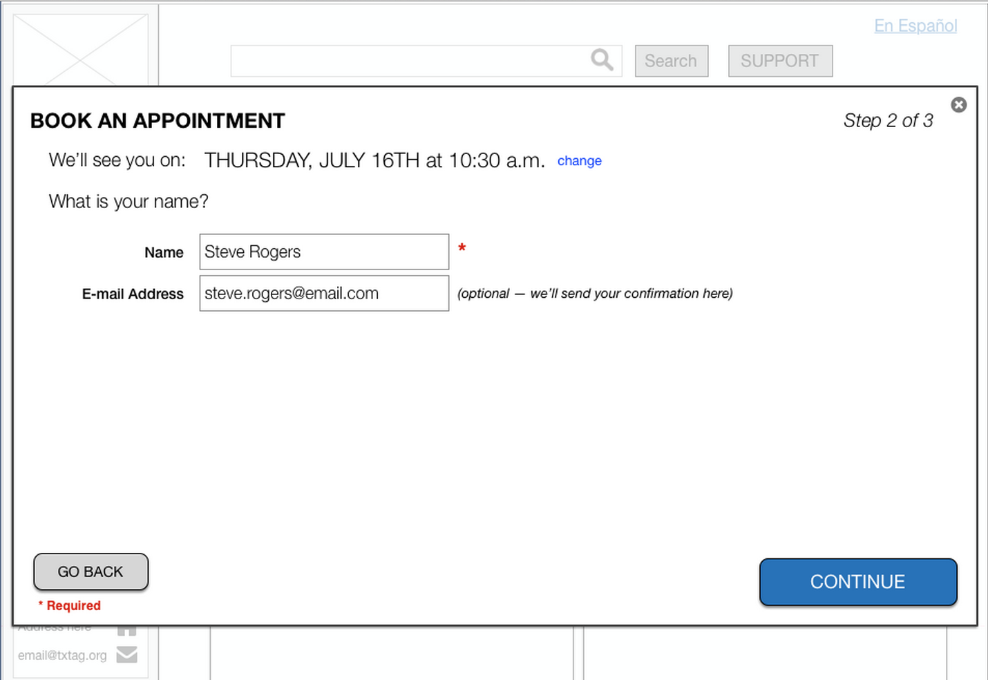
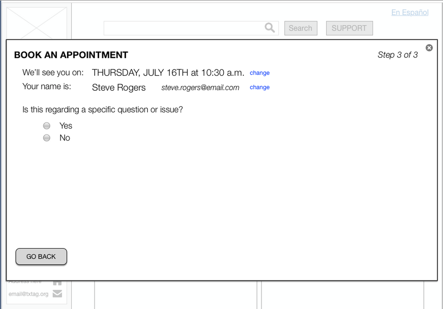
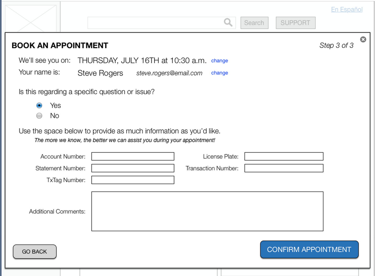
My key considerations for designing these flows were as follows:
1) Keep the language friendly - a customer needing support may have negative issues to resolve, and a light tone could prevent additional stress.
2) Update the user throughout the process - by seeing progress, users could be assured that they were close to completing their request. I also wanted to keep previous information visible and adjustable at all stages of the flow, to allow for changes.
3) Ask only for necessary information - similar to the first point, I wanted to avoid causing upset users to become overwhelmed by complicated questions.
4) Provide space for (optional) open-ended information - while some users want quick completion, others may want to provide supplemental information about their issue. From the client’s point of view, having specific information could save time by allowing customer service representatives to prepare a resolution prior to the appointment.
REFINEMENT
A challenge that I had with this design was addressing the need for simplification while also accounting for the fact that users may need help with a wide variety of issues. With additional time, I would test different flows in an A/B scenario to see how users completed a form that required more information about their support request, versus forms that kept questions to an absolute minimum.
Another important next step would be to submit our prototype for user testing, in order to validate our design decisions. By determining which forms users found simple, and which caused confusion, we could apply changes and continue to improve our designs.
FUTURE IDEAS
Outside of the scope of these page redesigns, our team came up with ideas that may be worth exploring for the client:
Loyalty & Referral Programs
Opt-in Feature on Driver’s License & Vehicle Registration
People respond to incentives, and if given additional benefits for having a TxTag, we predict there would be a significant increase in TxTag registration.
Inaccurate addresses and vehicle information frequently caused bills to be issued in error. If drivers are already submitting documentation with their current address and vehicle information, adding the ability to opt-in to the TxTag program would deliver accurate data to the client as well as simplify user registration.
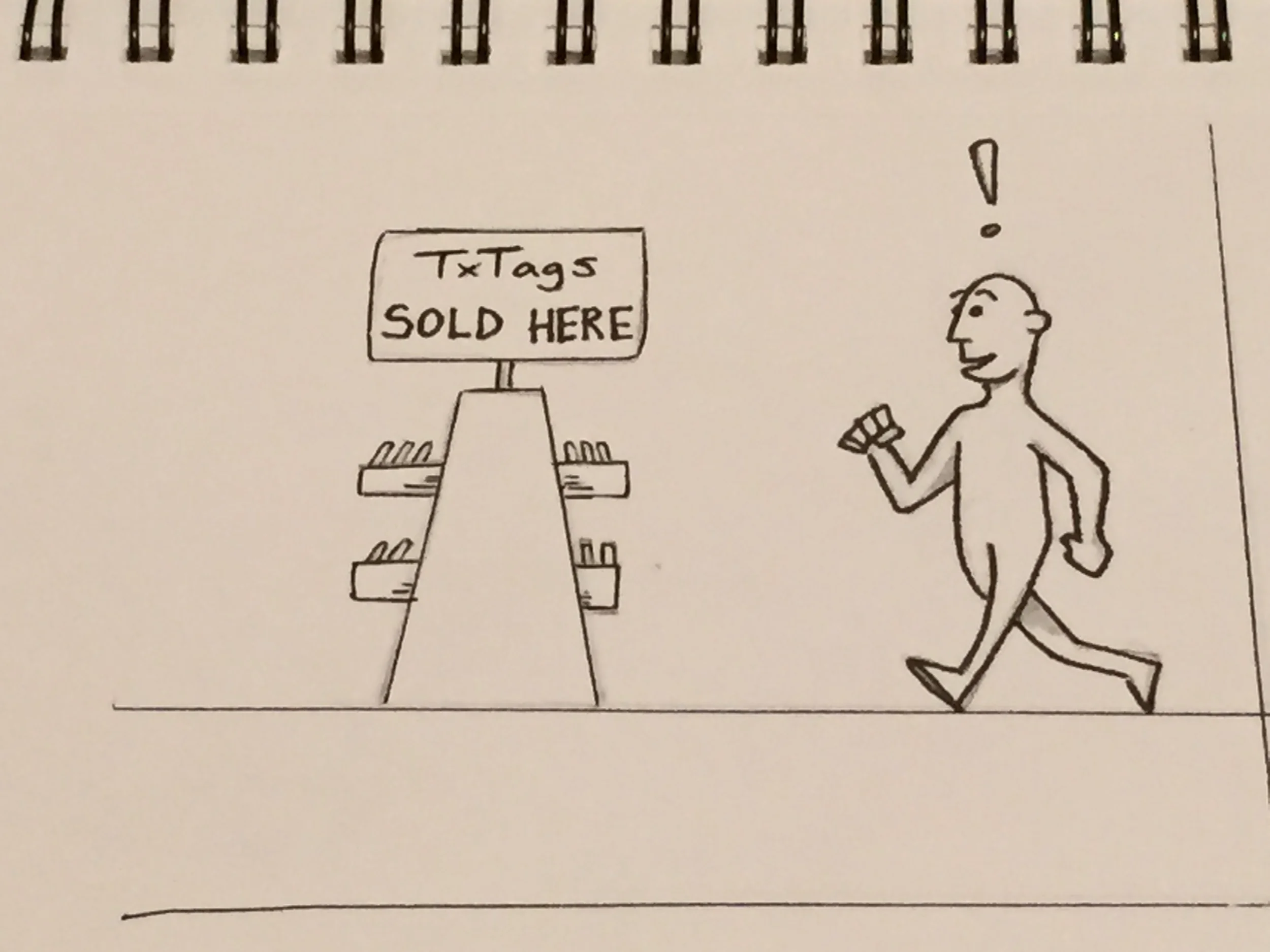
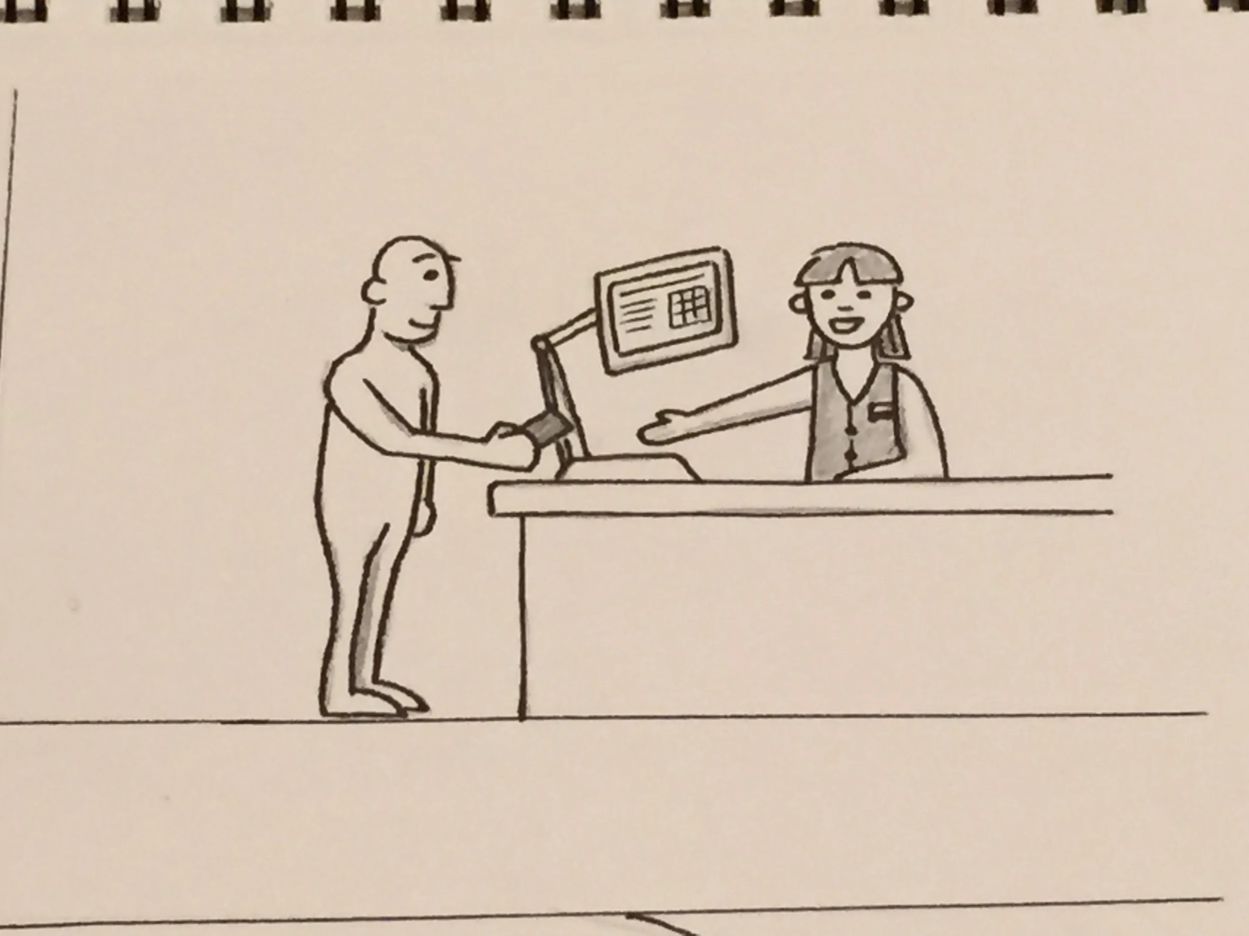
In-store Pick-up
In my research I noted that other states’ toll providers made it possible for drivers to purchase their tags in local pharmacies. This could streamline the registration process, and even integrate with a mobile app that allowed drivers to fully sync their information from their car.
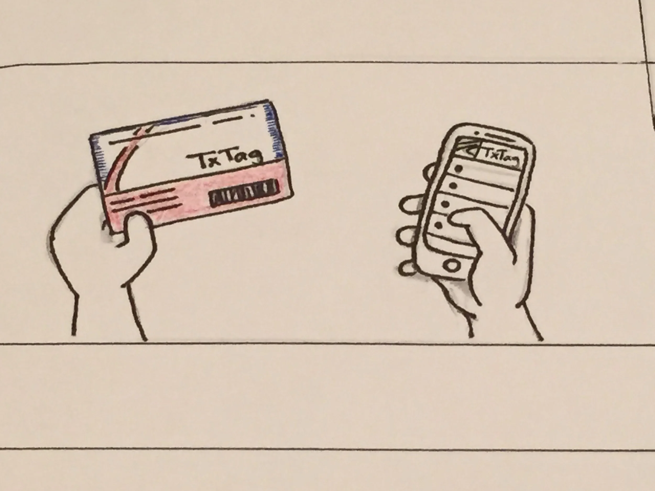
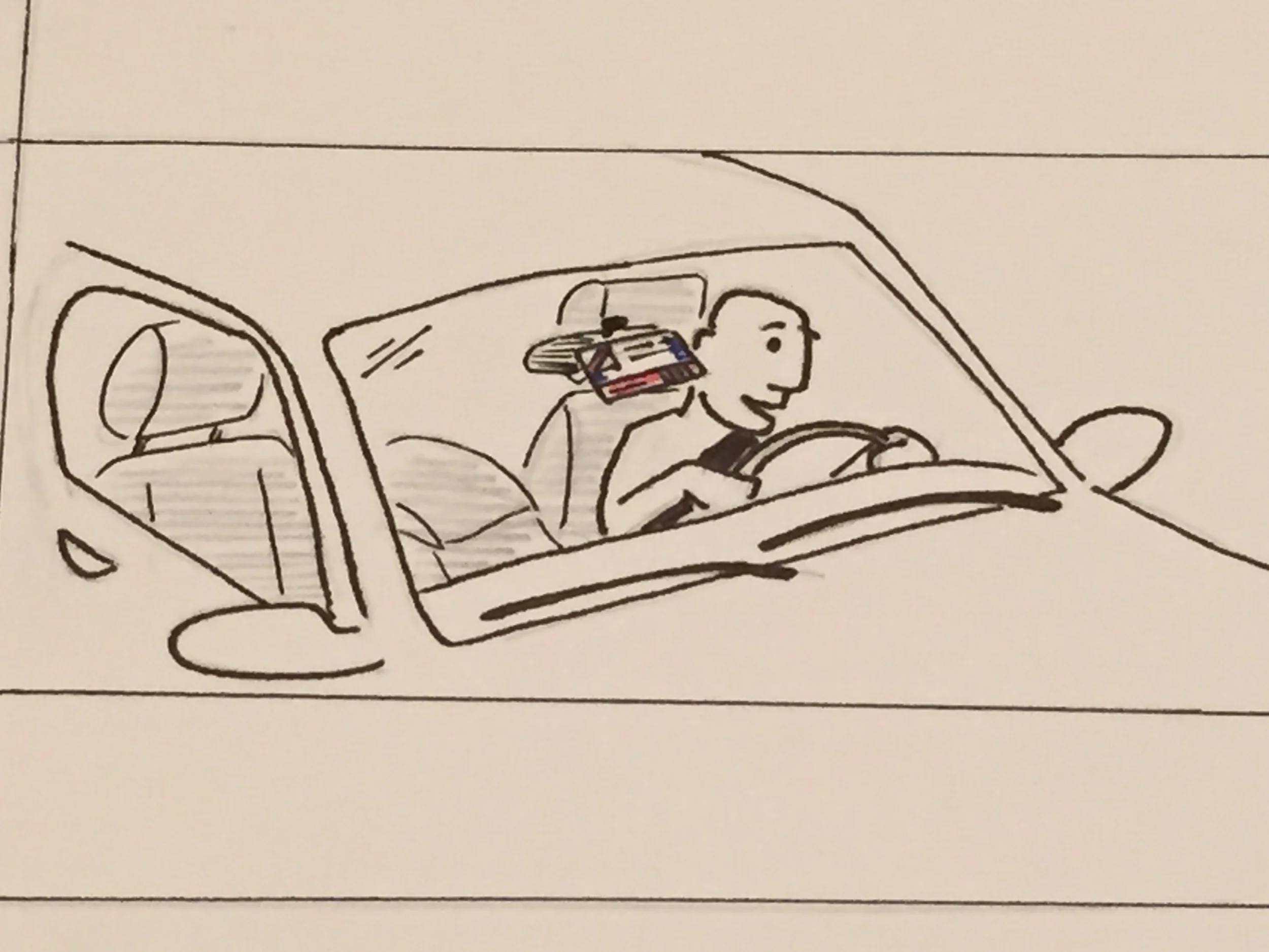
I drew another user story about this: